AfterShip Monetization
UI/UX design
Design system
Growth design
This is a project I worked on as a Mid-way designer at AfterShip. The company has been experiencing significant growth in the year of 2020 - 2022. As the business continued to expand, they are actively seeking ways to enhance the user experience when upgrading subscription plans for their product lines.
Challenges
The in-app subscription experience was a very complex system. There are many steps involves in the plan upgrade process. We needed to consider different stages of user scenarios and the notifications variations for different feature types. Also, as part of the product ecosystem, we need to think holistically and make sure our solution could be transferable to other AfterShip products.
Solution
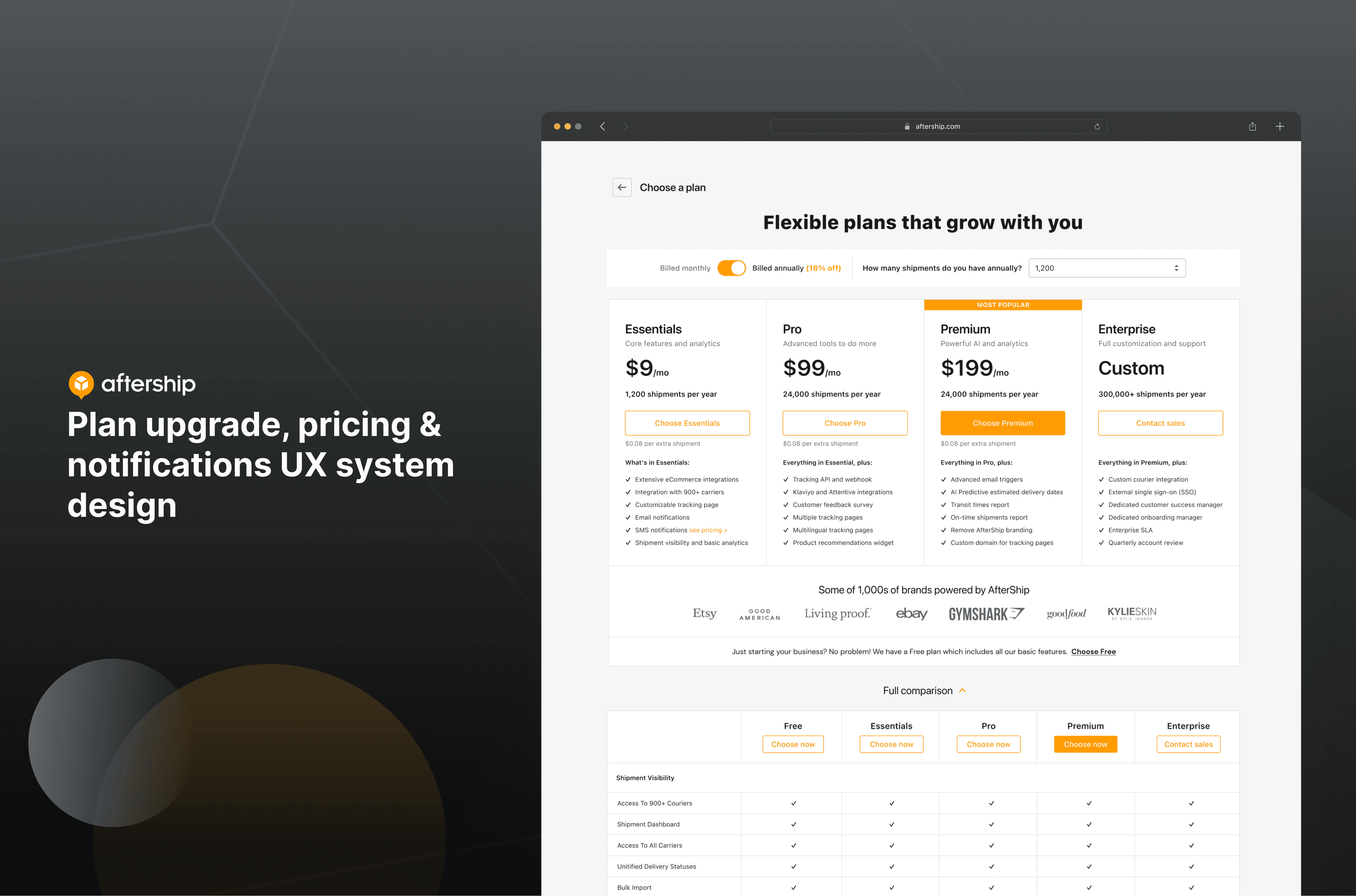
We designed a comprehensive subscription solution that covered all products in different user scenarios. The touch-points incudes pricing pages, notifications, pricing modals, homepage redesigns, and more. The impact was substantial both in terms of user satisfaction and overall engagement.
Understand user scenarios
The foundation a good subscription experiences is always the users. By given as a grand and complex problem as “improving the whole pricing and subscription experiences for all our products”, I would love to break it down into smaller and more actionable problems based on our users journey maps.
There’re many variables in this project: different users type, different stage of the subscription and different type of features.
This process helped us to understand the project scope.
Alignments with cross-functional teams
The Aftership product ecosystem have ~10 apps across post-purchase and pre-purchase (marketing). One of our challenges was to communicate with cross-product teams and leadership about our project scope. The goal was to align with priorities and include edge cases from different products as many as possible.
My takeaways was having a serving mindset and communicate it clearly: we’re here to help you minimize your tasks, not adding more works. Start with the highest business priority project.
Define design goals
How might we design a holistic subscription experience that help the business grow as well as bringing users a frictionless, fulfilling and efficient experience?
Solution 1
Re-design homepage layout & Plan upgrade card UI to improve CTR
Design homepage based on users behaviors by heat-map analysis
Homepage as the most-visited page served as an important gateway to upgrade plans. I did an heatmap analysis to understand how users behaviors were on this page to draw evidences of re-design. I also referred to our aftership tracking app to make sure our new design align with the company branding.
Design approach
The new design changed the up-to-bottom design to a left-right layout, which brought more attention to the plan upgrade card.
With the highly-clicked live chat section right below the upgrade card, we helped users find solutions more easily.
And instead of showing upgrade button on the top navigation, we moved it to the side navigation for a better IA and exposure.
Solution 2
Use A/B testing for billing modal and check-out flow design
Make user-centered design decisions based on scientific A/B testing method
We came up with five - six UI design for the check-out modal, narrowing down to 2 most confident ones. From there, we used a A/B testing method to decide the winning version.
Finishing up the check-out flow design by mapping out all possible scenarios: tax calculations, discount calculation, error notifications and edge cases, etc. Handed out to engineers with all the UX notes and instructions.
Solution 3
Improve features-upgrade UX flows by building a UX system
Systematically understand all user scenarios as well as user journey throughout all the upgrade story
The challenge here was to create a systematic approach across all varieties of feature types and products. We wanted to make sure the flow was frictionless, understandable and consistent.
Solution 4
Developed and documented a UX guideline for Billing Notification v1.0
Conclusion
This project helped the company define a very good UX foundation of in-app plan upgrade. I was fortunate to be part of this impactful project and learnt a lot in terms of cross-functional communication, solving complex business problems and crafting user-friendly UX flows for our users.
“Keira's remarkable aptitude for fusing user-centered design with a understanding of business dynamics is truly commendable. What truly stands out is Keira's proactive approach and integration of business concepts, showcasing her dedication to excellence. Her collaborative nature and effective communication skills make her a valuable asset to any team, as she excels in translating complex ideas into user-friendly interfaces.”

Andrew Chan
Co-Founder & CMO at AfterShip


